Customization
Initial screen
The initial screen on Topper is the amount and asset selection.
To skip this screen on initialization and go straight to authentication, simply add the initial_screen query parameter to the URL like https://app.topperpay.com/?bt=<bootstrap token>&initial_screen=authentication.
| Amount selection screen | Authentication screen |
|---|---|
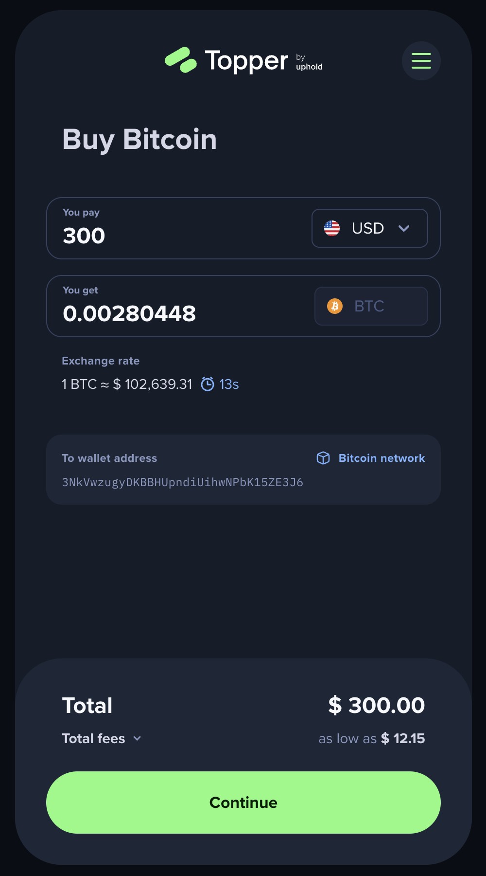 | 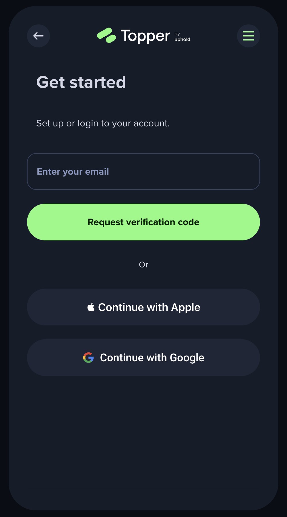 |
To pre-fill the email input on the authentication screen, add the user_email query parameter with the escaped email value.
What other initial screens are supported?
Currently only the Authentication screen is supported.
Using the Web SDK:
const topper = new TopperWebSdk({ initial_screen: TOPPER_INITIAL_SCREENS.AUTHENTICATION });

topper.initialize({ bootstrapToken: <bootstrap token> });
Locale
Which languages are supported by Topper?
Topper supports English, Brazilian Portuguese and Spanish.
How to set a specific locale?
By default, Topper will use the locale set on the user's browser. If that locale is not supported it will default to English.
To set a specific locale, you can set it as query parameter such as: https://app.topperpay.com/?bt=<bootstrap token>&locale=en. The supported values are en, en-US, pt, pt-BR, es and es-ES.
When the user authenticates in Topper, the locale will be set accordingly to the user preferences.
Using the Web SDK:
const topper = new TopperWebSdk({ locale: TOPPER_LOCALES.PT });

topper.initialize({ bootstrapToken: <bootstrap token> });
Theming
Custom
Topper supports custom themes so you can seamlessly integrate our widget with your brand's look and feel. You can customize colors, logo, or both to match your website or app.
What can be customized?
-
Colors: Personalize the colors of various elements, including backgrounds, buttons, text and more.
-
Logo: Display your own logo in the header. You can provide separate logos for desktop and mobile views (or use the same for both). You also have the option to position your logo on the left or in the center (which is the default).
- Maximum dimensions: 180px x 40px
- Supported formats: SVG or PNG
How to use your custom theme?
Once your custom theme is set up, it will be associated with a unique theme name (e.g. foo-theme). To apply it, simply include the theme name in your bootstrap URL like this https://app.topperpay.com/?bt=<bootstrap token>&theme=foo-theme.
Using the Web SDK:
const topper = new TopperWebSdk({ theme: 'foo-theme' });

topper.initialize({ bootstrapToken: <bootstrap token> });
Custom themes need to be configured on our end. Please reach out to your account manager for more details.
Theme validation
Custom themes are validated and tied exclusively to their associated widget, ensuring they cannot be used by unauthorized parties. If an invalid theme name is provided, we'll default to our dark theme.
Default
Topper also supports by default light and dark themes.
The default is the dark theme, but you can easily switch by adding &theme=light to the URL, such as https://app.topperpay.com/?bt=<bootstrap token>&theme=light.
Using the Web SDK:
const topper = new TopperWebSdk({ theme: TOPPER_THEMES.LIGHT });

topper.initialize({ bootstrapToken: <bootstrap token> });